

When a category is no longer in question,
All brands end up looking alike.
How Amandín decided to blaze his own trail.
Customer and sector
Categories also develop conventions. Over time, certain colors, images, and words end up defining how a product must be presented in order to be recognized as part of a market.
Amandín is a brand specialising in organic food and plant-based drinks. When our collaboration began, more than twenty years ago, the visual language of the sector was dominated by earth tones, greens, illustrations and references to cultivation and nature. It was a widely accepted visual communication, but it also made many brands end up resembling each other.
Context of the problem
We had to build a brand capable of growing without being diluted: gaining visibility, incorporating new references and accompanying Amandín's expansion while maintaining a recognizable, coherent and differential identity.
We began to break with the traditional codes in the first powder formats, still within a very small niche. The transition to brick allowed that decision to acquire scale, presence on the shelf and ability to order an increasingly wide range.
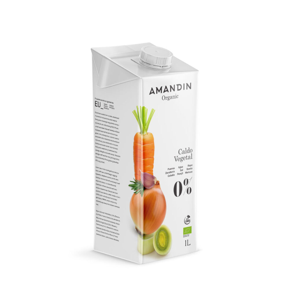
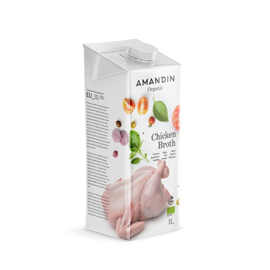
First approximations of the image.
Voltage Detected
The category associated the ecological with a certain aesthetic. Breaking that language implied taking a risk.
The question was clear: could an organic brand communicate with the same level of demand, sophistication and clarity as any other benchmark brand on the mainstream market?
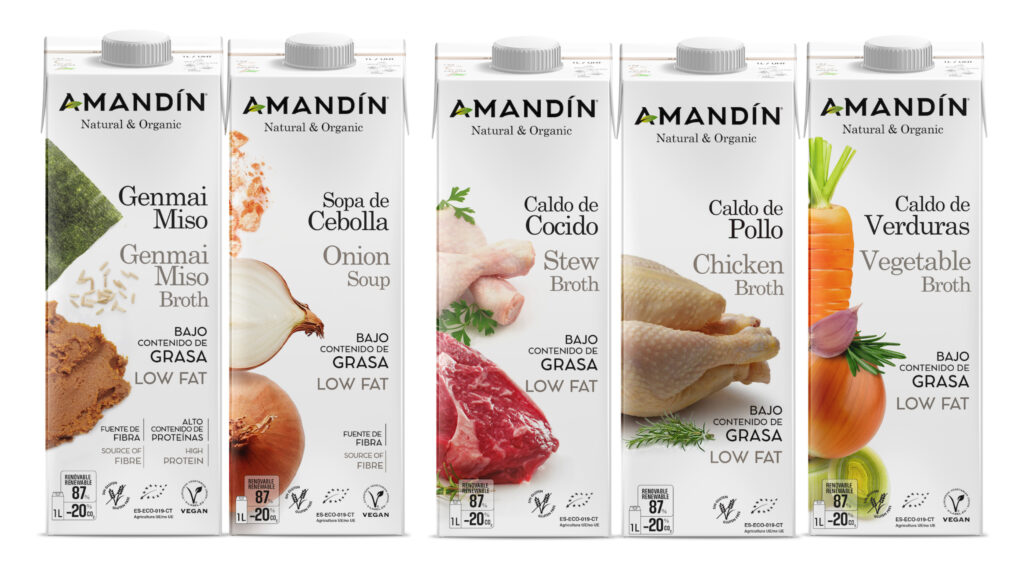
On a shelf where all the packaging shared earth tones, greens and illustrations, a white carton with a colour photograph represented much more than an aesthetic decision. It was a strategic decision. It entailed a different positioning and a new way of communicating the value of an organic product.
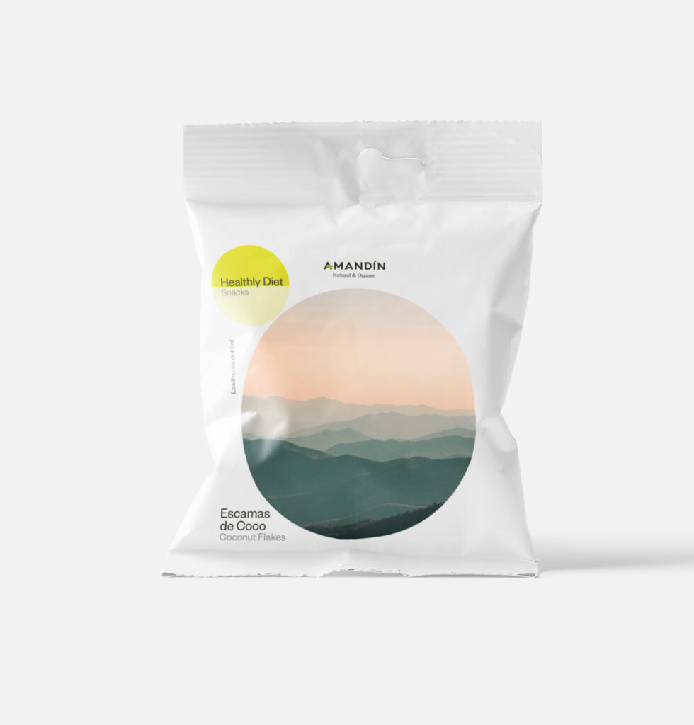
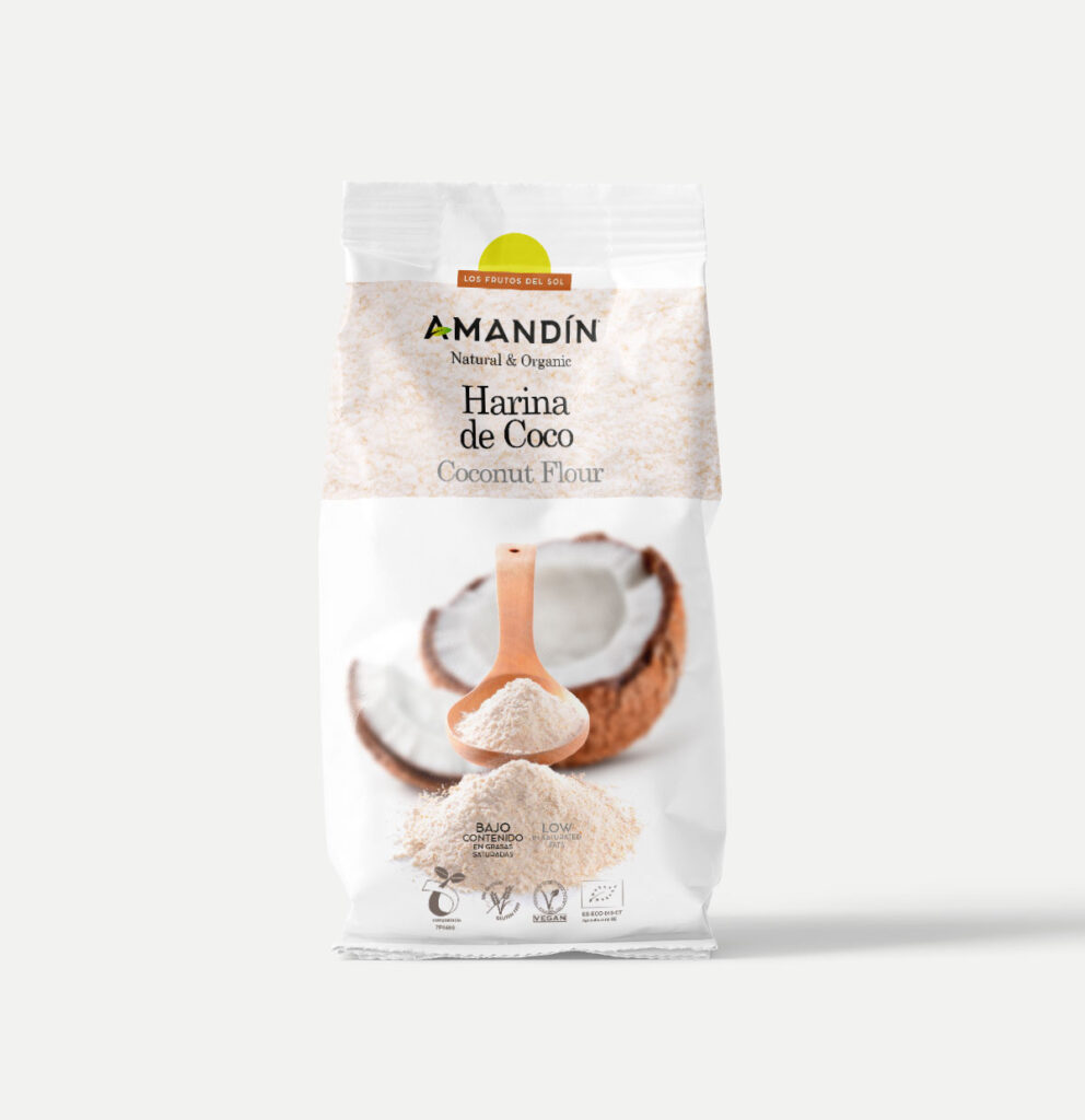
Pilot tests for various references
Diagnosis Dlab_
The consumer didn't need any more signs that the product was organic. That was demonstrated by the certifications and the ingredients. They needed to perceive more clearly why this was a better choice.
Strategic decision
The most valuable strategic decisions usually require the courage to question what everyone takes for granted. Betting on a visual language different from that of an entire category requires conviction, a long-term vision and the ability to sustain that decision over time. Amandín's management decided to take that risk.
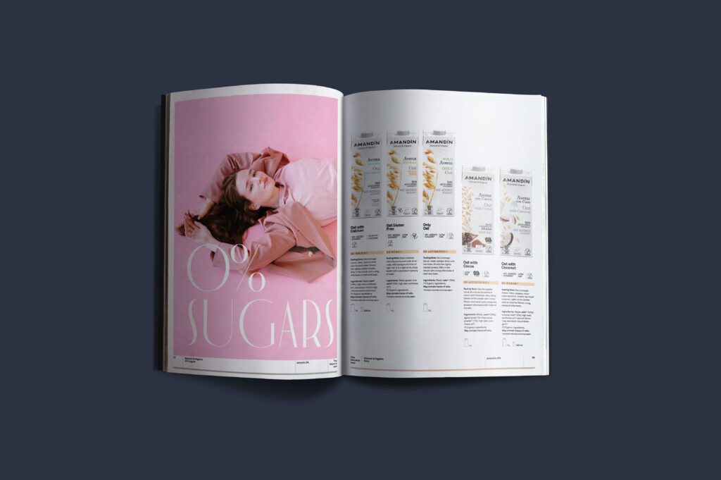
The strategy consisted of building its own visual language. The white and colour photography of the ingredients, already present in the powder formats, was consolidated, giving rise to an image deliberately far from the language to which the eco consumer was accustomed.
On the shelf, the photographs were completed from one carton to the next. Each container worked separately, but together they completed a larger image.
The brand began to build its own and differential presence capable of growing and evolving coherently for years.
The uniqueness of the carton was also recognised outside the company: Tetra Pak requested permission to include it in one of its yearbooks of featured packaging.
Verbal, visual and perceptual results
Amandín began to occupy its own territory within organic food: a natural and accessible brand, as well as clear, contemporary and sophisticated.
The change transformed perception. Amandín began to be recognized for its own way of presenting the product.
Identity accompanied the brand's growth for nearly two decades without losing consistency, even as ranges, markets and touchpoints increased.
Materialization of the strategy
A strategy proves its value when it can evolve without losing its essence.
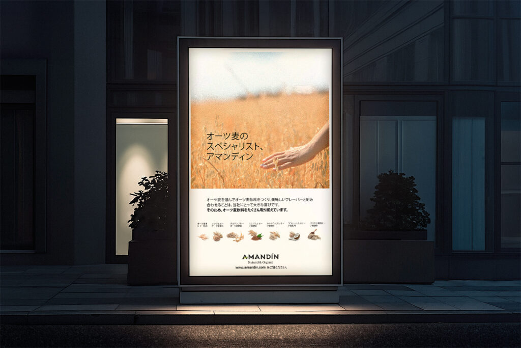
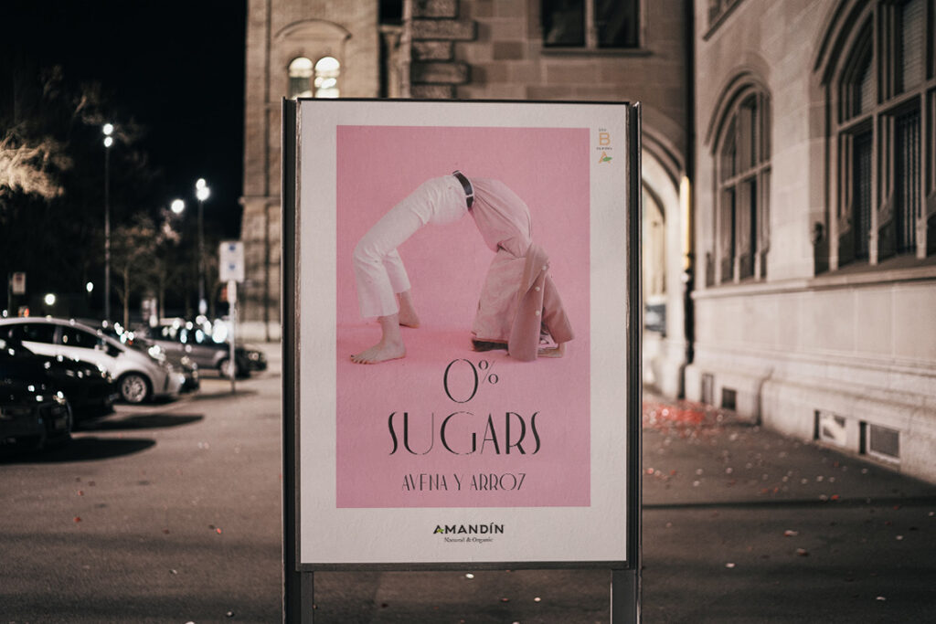
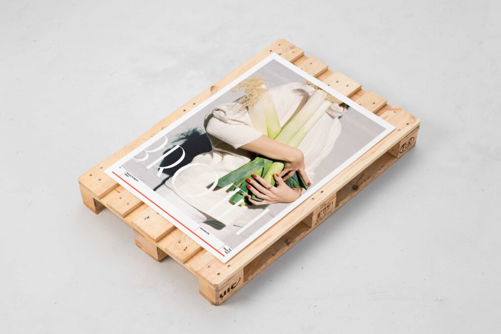
The language was consolidated and transferred to a wide diversity of packaging, campaigns, catalogs, international fairs, commercial communication, presentations, export materials, extending to all the brand's points of contact.
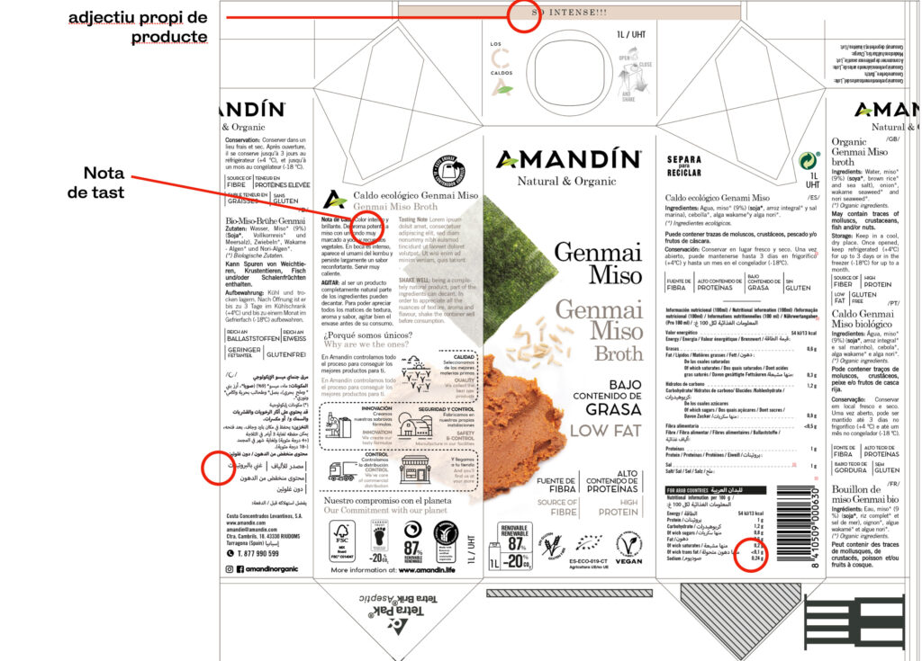
The last major evolution once again questioned the codes of the category. The cartons incorporated part of the production process and tasting notes developed together with a professional sommelier. The organoleptic properties: flavour, texture, aroma, intensity, persistence and personality helped to understand the differences between references and made the choice a more informed and gastronomic experience.
The applications were changing. The criterion remained.
Case learning
Categories evolve when someone dares to question their conventions.
Brands that last are those that find their own way to express what makes them valuable.
Sometimes innovation is about making the world
Look at a product in a different way again.
Internal links to related services
· Brand repositioning
· Brand positioning
· Visual identity
· Packaging system
· Brand Narrative
· Creative direction
· Corporate communication