Before the first mechanism existed, there was already a unique way of looking.
Customer and sector
Family businesses accumulate knowledge, craft and their own way of doing things. The next generation often brings something different: a new way of interpreting that legacy.
Fontini is a second-generation company specialising in the manufacture of porcelain and metal electrical mechanisms. Its porcelain switches had achieved wide recognition, especially in projects linked to rural environments and classically inspired architecture.
Roger Font, after years working in the family business, began to imagine a brand capable of projecting that industrial knowledge into a more contemporary universe, connected to architecture and design.
That vision would end up becoming font barcelona.
Background
The first conversations did not revolve around the product but around the world where that future brand should live.
Contemporaneity, Barcelona, architecture, design, culture, objects, materials, provocation.
We built that habitat by sharing references, intuitions and ideas. Some seemed impossible – such as imagining haute couture dresses made from porcelain fragments to explain the multiple lives that a material capable of recycling itself can have over and over again – but they all pursued the same goal: to define their sensitivity, their level of demand and the attitude with which they would present themselves to the world.
Meanwhile, Roger shared that same vision with Oriol Guimerà, who together with Joan Cinca, developed the industrial design of the first mechanisms.
They were two different paths with the same direction.
Voltage Detected
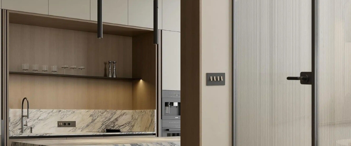
The switch had been part of the everyday landscape for decades until it became a practically invisible object.
In a space we carefully choose lamps, chairs, a vase, a painting or any other decorative element. We admire their shape, material, texture or personality that they bring to the whole.
The electrical mechanism, despite being present in all rooms and used several times a day, was still treated as a functional component intended to be discreetly integrated into the wall.
The challenge was to present switches conceived as design objects and to get the interlocutor to give them the attention they deserved.
The brand strategy gave them the place from which they could express themselves with all their personality.
dlab diagnosis
The deep meaning of font barcelona was in its attitude.
Roger promoted a personal evolution of the industrial legacy. Guimerà and Cinca were designing the first mechanisms with the demand, presence and detail of a piece of jewellery, while we conceived the brand universe with the desire to evolve, explore and question the established.
For months we had built the world where those mechanisms were going to express themselves. When we saw the first prototypes of the 5.1 collection, everything fell into place.
That shared vision meant that the names of the collections, the tone, the voice, the images, the product and each subsequent decision arose from the same way of looking.
Strategic decision
We make a provocative attitude the central criterion of the brand.
We took the switch out of its usual visual context. He left the wall and the environments full of elements to appear before the camera as the absolute protagonist. We presented him as if he were an architectural piece or a sculpture.
They no longer needed a set. The mechanism was the protagonist. An object capable of arousing admiration for its volume, its texture, the precision of its details and the quality of its materials.
Verbal language directly challenged the observer. Claims such as we're so bold and don't be so square expressed security, irreverence and an invitation to awaken our gaze and question ourselves:
Why do we accept any switch in a space where we take care of every object we choose?
Why can't a mechanism be conceived to be seen, admired, exhibited or even become an object of worship beyond its own function?
The strategy found the support of the marketing department led by Marc Tierz, who understood the importance of building a different brand and opted to develop that way of communicating with coherence and continuity.
Verbal, visual and perceptual results
Communication managed to move the electrical mechanisms to a territory where they had never been before.
Font Barcelona talked one-on-one with architecture, interior design, design and contemporary culture.
The pieces acquired presence. Each image reinforced the same idea: the switches deserved to occupy a visible place within the space, not just turn the light on and off.
We built our own, recognizable and coherent language, where each element reinforced the same look.
Materialization of the strategy
We develop and decide on the names of the collections based on a process of observation and interpretation of each of them.
In the first collection, 5.1, we already laid the foundations for a unique way of understanding the product.
Then came C, C low, bridge and solo, expanding the brand's universe without ever losing coherence and consistency.
Photography, catalogues, packaging, digital identity, newsletters, commercial communication, international fairs and every interaction reinforced the same positioning.
The brand evolved. The way of looking remained.
Case learning
The strongest brands are built by sharing a common vision before each discipline starts working. That vision creates a space where the brand can grow, express itself, and acquire meaning and authenticity, allowing different specialists to bring the best of their craft to the table with autonomy and a common direction.
Font Barcelona proves that an everyday object can become the center of attention when someone reveals its value and gives it the place it deserves.
Related dlab services
Brand grounding · strategic diagnosis · brand platform · positioning · naming · brand narrative · creative direction · visual identity · packaging system · corporate communication · brand activation · brand systems